Luca Napolitano celebrates 115 years of Lancia history, with episode 2 of the docufilm “Elegance on the move”
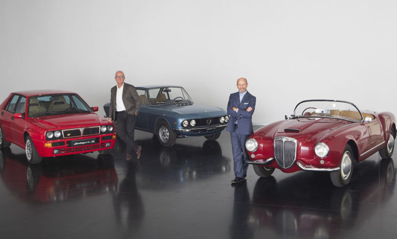
In chapter 2 of the documentary series on the 115 years of Lancia history – entitled “A brand and its unique identity” – Luca Napolitano, CEO of the Lancia brand, and Roberto Giolito, Head of Heritage Alfa Romeo, Fiat, Lancia and Abarth brands, talk about the evolution of the logo and the origin of the names of Lancia’s iconic cars. The journey through time continues, from 1906 to the present day, to discover a brand that has always remained in people’s hearts for its glorious past, but is today projected into the future of mobility. Episode 2 of the docufilm can be viewed here.

fter having discussed about Design with Jean-Pierre Ploué, Stellantis Chief Design Officer* and Head of Lancia Design, part 2 of the docufilm on the 115 years of Lancia history is now airing, with Luca Napolitano, Lancia Chief Executive Officer, talking with Roberto Giolito, Head of Heritage Alfa Romeo, Fiat, Lancia and Abarth brands, about the evolution of the Lancia logo, intermingling its history with the names of the brand’s models.
“Lancia is a brand with an identity that was created in the early days and remained unchanged for 115 years,” stated Luca Napolitano, CEO of the Lancia brand. “A strong identity made of an elegant, distinctive logo, but also of many names of iconic models that featured in the dreams of millions of enthusiasts. They are inspired by the Greek alphabet and by the consular roads of ancient Rome. This is a heritage that few other car brands can boast, one we want to preserve and one from which we will draw inspiration to build the future of the new Lancia.”
The evolution of an elegant, distinctive and noble symbol
The history and the identity of Lancia must also be seen from the perspective of the evolution of its logo, which has long featured two fundamental elements: a steering wheel and a lance.
1907. Lancia, a brand with a capital “L”
The first logo in Lancia history was unveiled in 1907, and is very simple and essential. The name “Lancia” is written in white capital letters on a dark and rectangular background. The “L”, considerably larger and slightly offset, is a stylistic element that would distinguish the logo for decades. The font is clear, with serifs on the corners of the letters. At the same year, a “softer” version of the logo was also launched, which coexists with the first one and in which the word Lancia is in golden italics. This more sinuous and elegant version ideally matches the style of the first cars made by the Turin-based automaker with the aesthetics of that time, dominated by Art Nouveau.
1911. Sketches by Count Carlo Biscaretti di Ruffia
In the wake of his increasing success, Vincenzo Lancia wanted a powerful logo for his creations, one everyone could recognize at first glance, embodying the values and innovative spirit of his cars. In 1911, he therefore entrusted the task to a dear friend of his, Count Carlo Biscaretti di Ruffia, an illustrator, advertiser and a big fan of cars, as well as the founder of the Museo Nazionale dell’Automobile in Turin.
“Biscaretti di Ruffia produced 5 different sketches, drawn by hand and painted in watercolors,” explained Roberto Giolito, Head of Heritage Alfa Romeo, Fiat, Lancia and Abarth brands. “Vincenzo Lancia selected the one that best represented the brand’s philosophy, with some of its trademarks: a four-spoke steering wheel, a hand-controlled accelerator, a rectangular flag, and a rod shaped like a lance. Just a few elements, all well set out, some of which would remain unchanged over time”. The new logo started to be used in 1922.
1929. A lance and a shield, a noble, elegant and recognizable symbol
In 1929, the Lancia logo changed shape again and around the steering wheel appeared a triangular shield, a stylistic element that remains to this day. Designed by Biscaretti di Ruffia, some of the logo’s design cues were then stylized, with the colors already having been decided on: blue was used for the shield, flag and lance, the background and steering wheel were white, and the profiles and most of all the lettering were embellished with gold.
1957. A radical restyling of the logo
In 1957, when the Flaminia was introduced, alongside it came a new logo: essential, but still noble and elegant. This was a radical restyling, in a leaner style. The shield and steering wheel were replaced by simple, stylized geometrical forms and the previous widespread use of color was replaced by two-tone blue and silver. However, this version retained two of its characteristic design cues: the lance holding up the flag, and the flag itself marked “Lancia”, again in capital letters, as well as the unmissable initial “L”.
1981. A bridge to the past
In 1969, when Lancia was acquired by the Fiat Group, the logo underwent another major restyling. In fact, the “original” rectangular 1907 logo was brought back and up to date. The first car to use the new symbol was the 1972 Beta. In 1981, a further evolution then took place, once again building a bridge to the past. The designer Massimo Vignelli suggested all the elements used in previous logos, taking the 1929 version as a starting point and bringing it up to date. The shield, spear, steering wheel and flag were stylized, while the choice of colors was limited to an alternation between blue and white. For the first time, the letter “L” was resized to the same as the other letters.
2007. The elegance of a logo for the new millennium
The major changes taking place in the Lancia brand in the early years of the third millennium also involved the logo. In 2007, there was a revolution from an aesthetic point of view, although some of the elements most typical of the brand’s DNA were maintained. First and foremost the blue color, made darker and more glossy, followed by a contoured shield. The steering wheel was completely revisited in the name of minimalism, with the four spokes transformed into two “tips” above and below the word “Lancia”, and the lance and flag bearing the logo no longer appearing.
Greco-Roman classicism in the names of iconic Lancia cars
The evolution of the Lancia logo is fascinating, but so is the history of the names of its cars, inspired by the priceless cultural heritage of the ancient civilizations of Rome and Greece.
From horsepower to letters from the Greek alphabet
In the first few decades of the 20th century, all Lancias were identified with the brand name and their registered horsepower: 12 HP, 18/24 HP, 20/30 HP, 25/35 HP. Then, in 1919 came an inspiration that would change history. Vincenzo Lancia wished to give his creations an even stronger identity, and at the suggestion of his brother Giovanni – a Classics scholar – he would identify his cars with letters from the Greek alphabet, the first of which was the 1919 Lancia Kappa. A revolutionary idea, it led the company to all the cars it had produced to date, starting from the 12 HP, renamed “Alpha”, then continuing with the Beta (1909), the Gamma (1910), and the Delta (1911), all the way to the Lambda, unveiled in 1922, first at the Paris Motor Show and then at its London counterpart. At the same time, they started to take on the prefixes “di” and “tri”, to identify versions derived from the original model, representing developments or mere tune-ups created ad hoc. The final Lancia to use a Greek letter was the “Dilambda”, the prototype of which was unveiled at the 1929 New York Motor Show.
The 1930s and names from ancient Rome
In the same period, another change was made to the cars’ names. Vincenzo Lancia decided to give up on the Greek alphabet to pay tribute to Italy, naming his cars after historic locations in the ancient Rome. The first were the Artena and Astura, followed by the Augusta, Aprilia and Ardea. Then, in 1931, to market his cars in France, Vincenzo Lancia founded “Lancia Automobiles”, and gave his cars French names: the “Belna” and the “Ardennes”, i.e. the Augusta and Aprilia, were previewed at the Paris Motor Show. They were such an immediate success that, at the 1936 Paris Motor Show, Henry Ford said to have been waiting for the doors to close to see the Aprilia up close and personal, against the wishes of the security guards who stopped him in his tracks. He is reputed to have said: “The Aprilia is the only car on show it’s worth making a scene over”.
The 1950s. Lancia’s icons are renamed after the Roman consular roads
After World War II, when the company passed on to Gianni Lancia, the founder’s son, Lancia cars would change their names once again. The theme of Roman times continued, but now focused on the consular roads: the Aurelia and the Appia, to be followed by the Flaminia, Flavia and Fulvia. At that time, the Flaminia was used as none other than the Italian President’s car: a special version, four models of which were made in 1961 for Queen Elizabeth II’s visit to Italy. And, in line with a tradition at the former papal stables, the Scuderie del Quirinale, each model was named after one of its thoroughbred horses: Belfiore, Belmonte, Belvedere and Belsito.
From the 1970s to the present day: a return to the Greek alphabet
The Fiat Group purchased Lancia in fall 1969, opening a new era for the brand. A decision was then made to return to the original logo and to rename the cars after the letters of the Greek alphabet. The first car to witness this change was the 1972 Beta, followed in 1976 by the Gamma and in 1979 by the Delta. The tradition of Classical names then continued with the Prisma (1982), the flagship Thema (1984), and so it went until most recent Thesis and Phedra in 2002, and the third-generation Delta in 2008. We then come to the New Ypsilon (2020), the heir of a bestseller that, through its 35 years of history, 4 generations and 35 special series, has always been contemporary, having established itself as the “fashion city car”, with over 3 million units sold.
The strong identity of the Lancia brand consists of its elegant, distinctive logo, and of the many names of its most iconic cars. A rich heritage from which to draw inspiration, to write a new chapter in the history of the brand that since 1906 continues to be one of the best-loved and admired car marques in the world.
The story continues…


